#iseeDC2020: Architecture, Equity, and the Pandemic


Of the 10 favorites, a 1st Runner-up and 2nd Runner-up were selected for the first time by the jury.
Congrats: Ryohei Saito, AIA and Ken Pak

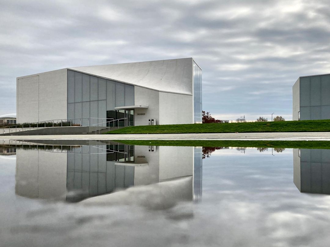
1st Runner-up
The REACH The Kennedy Center Extension by Steven Holl ArchitectsThe REACH at the Kennedy Center
November 30, 2020
Photo: Ryohei Saito, AIA
@s_t_r_h
Juror Comments:
“Each time I see this image I think about reflection. I reflect on our moment in time, on our city and on how architecture can help healing. Clouds contrasting with buildings, clouds diffusing on buildings, sharp edge lines of landscape mediating between the two … great techniques that provide an oasis for all.”
—Francesca
Franchi
“Good composition here is reinforced by rich tonality. It’s often difficult to get such a lush image in diffused light and narrow color range. The softness of clouds in the sky and reflection are a good counterpoint to the angularity of the building.”
—Alan
Karchmer

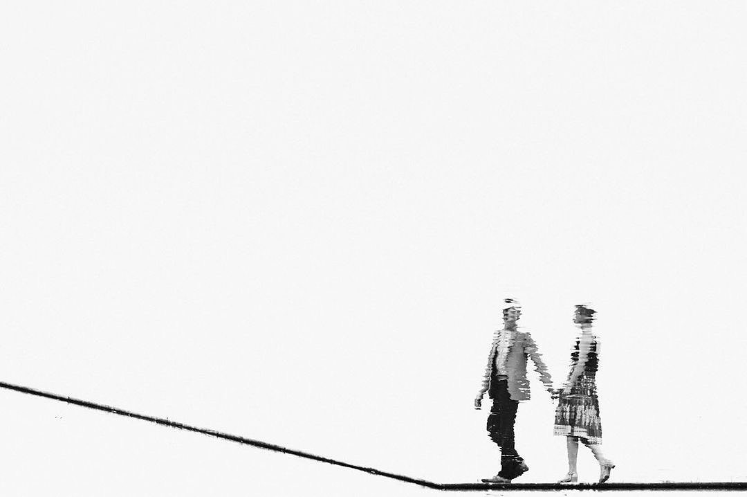
2nd Runner-up
Janice + BenU.S. National Arboretum
November 16, 2020
Photo: Ken Pak
@kenpakphotography via @exposed_dc
Juror Comments:
“The power of the composition is imagination. Abstract purity and whiteness provide the photographic space for the figures to express their message of togetherness. How was the line achieved at the National Arboretum … does it matter? All what matters is the line projecting optimistically upward.”
—Francesca
Franchi
“Apart from its merit as a well framed monochromatic, minimalist composition, this photograph leaves me wondering about just what I am seeing. It looks like a reflection but where the figures fall in the image defies physics. Everything from line, to tonality, to content works beautifully together.”
—Alan Karchmer
Back to #iseeDC2020
